Monday, February 23, 2015
Friday, February 20, 2015
Fairytale Idea
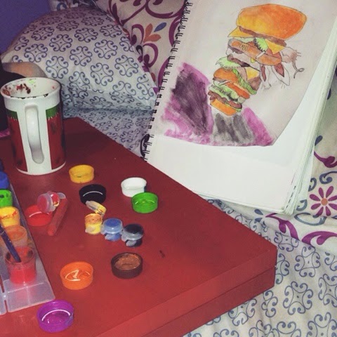
Have you ever read "The Real story of the 3 little pigs"? Well in the book the big bad wolf is fixing him a sandwich & so far this is what I have right now. As a child this has always been my favorite fairytale. My plan is to kind of collage it with all of the other 3 little pigs stories. So as you can see in the second picture everything was sketched then watercolor was added
Friday, January 30, 2015
Late thought
When I saw this quote about art I never looked at art for me to make other see what art was about I've always saw art how I wanted to see it.
"The Sandman" Project
For this assignment I put together a multimedia picture. The first thing that came to mind was that it needed to be a sandman type of feel. I did not want to copy straight for the source so I made the picture look like my own. I stated by using a cloud background to keep it natural but still have a little fun for the piece. Also, I didn't want to use boring colors so I picked really bright colors to make the pictures pop. Once I put it all together it came out pretty cool.
Monday, January 26, 2015
Nefarious
I used Ursula because when I think of nefarious which means evil, Ursula was the first thing that popped up in my mind. So what I did was searched her in the search engine & Sketched her out. Most of my materials included pastels, a black sharpie & color pencils. It actually turned out better than what I had pictured.
Friday, December 19, 2014
Friday, October 10, 2014
This is my illustrator portrait and I kind of enjoyed illustrator better but doing this assignment i realized some of the differences between photo shop and illustrator which was illustrator is a shape maker type thing, you can create pictures just by using shapes. The difference between vector and raster is that photo shop is used for vector which means its determining a position to one space. Raster is used for illustrator because its a pattern for line to line. The tools I used and learned is illustrator were pen tool and eye dropper. The pen tool was to make the shaped on my face and the eye dropper was to select the colors that showed the most in that shape. My favorite part on this assignment was actually my chest because the colors looked better. My least favorite part was my eye only because when it was finished the colors didn't really make sense. If i were given this assignment again I would totally start from the bottom and lead up to the top. Overall, the portrait turned out better than I expected it to be. 

Subscribe to:
Posts (Atom)